Monopoly patent
Tuesday, February 7th, 2012 • Design

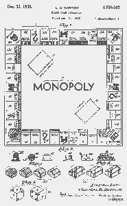
The cover page of Charles Darrow’s 1935 patent application for the Monopoly game. Apparently the origins of the game are in dispute—the game was invented years before Darrow’s Atlantic City version (and the game’s concept has straddled the edges of intellectual property definitions since its creation). The original version of the game had an entire second stage of play in which all the real estate monopolies are dissolved—for various reasons this concept doesn’t survive into the current incarnation of the game.
But the visuals do! My grandfather owned several automotive patents, so I’m familiar with the rigid, inflexible visual lexicon of patent applications (of which he, my grandfather, was very scornful—he hated to have to draw his streamlined compound curves in a style created in the horse-and-buggy era). Patents are still drawn in the same archaic crosshatched style today as they were at the turn of the century. But the “Monopoly” patent is interesting (especially in light of the dubious origins of the game) since it looks more like a design trademark or copyright application than a patent diagram. Look at that game board image, and how nearly identical it is to the contemporary version of the game! Darrow is implicitly asserting that the game must be played this way, from a visual standpoint, on a board that looks like this. The abstractions of “Monopoly” are fused to the game’s fonts, images, typography and proportions. (By contrast, Apple’s iPhone/iPad patents abstract the geometry of the machines to a much greater degree.) If you don’t use Futura Light, it’s not Monopoly.